The level design of a single room in Half-Life 2
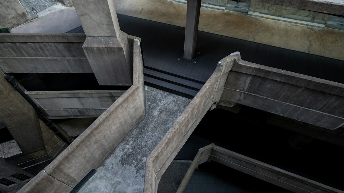
There's a small checkpoint room in the opening trainyard sequence of Half-Life 2 that most players walk through in under a minute without noticing anything happened. It's a bare, grey space with a security camera, a locked gate, and a guard performing an ID check. Nothing explodes. Nobody shoots at you. And by the time you leave it, the game has quietly taught you most of the rules it's going to rely on for the next ten hours.
The room that isn't a tutorial
Valve's design philosophy for Half-Life 2, as documented in various postmortems from the team, was built around a specific aversion to text-based tutorials and pop-up prompts. The trainyard checkpoint room is one of the clearest demonstrations of the alternative approach: instead of telling you the game has a surveillance state and a scripted event system, it shows you both in the same sixty seconds, using only architecture, lighting and a single scripted animation.
The room is lit almost entirely from one harsh overhead source, with the security camera positioned so its red light is the first thing to catch your eye as you enter. That's not an accident of level art; it's the first instance of a visual language the game will use constantly afterward, where small red lights mean "something here is watching or armed." By the time you reach the Overwatch soldiers patrolling later levels, you already know what their equipment means without a single line of dialogue explaining it.
Linear doesn't mean simple
The room's layout is almost insultingly linear: one door in, one gate out, a single guard station in between. But the geometry does something subtler than just funneling you forward. The ceiling is low enough to feel oppressive without the player consciously registering why, the gate itself is visible from the moment you enter so you understand your goal immediately, and the guard's position forces a brief, forced pause exactly long enough for the game's first real piece of dialogue to land without feeling like it's interrupting movement.
This is the room's real trick: it uses linearity as a tool for pacing rather than a limitation the designers were stuck with. Every later level that opens up into something closer to open traversal is only legible because this room, and others like it early on, established a baseline vocabulary of space the player can now recognize variations on.
The guard as a scripted event, not a cutscene
The ID-check sequence itself is a short scripted animation rather than a cutscene; the player retains camera control throughout, which was a deliberate and, at the time, somewhat unusual choice. You can look away from the guard, examine the room, or stare at the ceiling, and the scene still plays out identically. That continuity of control across what could easily have been a loading-screen moment is part of why the opening sequence reads as a believable place rather than a series of set pieces strung together.
- Camera control never leaves the player, even during the scripted ID check.
- Lighting establishes a "watched" visual language the game reuses for the rest of its runtime.
- The linear layout is used to control pacing and attention, not just to funnel movement.
- No on-screen text or tutorial prompt appears anywhere in the sequence.
Why this still gets studied
Two decades on, this room shows up constantly in level design breakdowns and university game design courses, not because it's flashy but because it's unusually easy to point at and explain. Every choice in it is legible once you know to look for it, which makes it one of the best teaching examples in the medium for how environmental storytelling and mechanical onboarding can happen at the same time, in the same handful of square meters, without a single word of exposition.
It's worth replaying the opening hour of Half-Life 2 with this specific room in mind. Once you've seen how deliberately it's built, it becomes hard to walk through any corridor in the game afterward without noticing how much of its storytelling is happening in spaces you'd otherwise never think to pause in.
Comparing it to what came after
It's worth placing this room against the decade of level design that followed it, because so much of what became standard practice in first-person games traces directly back to choices made here. The "silent authority figure checking your identity" beat alone has been echoed, consciously or not, in a long line of later games that wanted to establish a surveillance-state tone quickly without a cutscene. What's less often copied, and arguably more valuable, is the restraint: Valve's team resisted the temptation to add a second or third checkpoint room reinforcing the same idea, trusting that one well-built example was enough to carry the lesson forward through the rest of the game.
That restraint shows up again later in Half-Life 2's pacing, in moments like the brief, almost wordless elevator rides between sections of City 17. Each borrows the same trust in environmental staging over explicit explanation that the trainyard room establishes first, which is part of why the whole game reads as a single, consistent design voice rather than a collection of set pieces bolted together.
A small room's larger argument
The broader argument this single room makes, intentionally or not, is that onboarding and world-building don't have to be separate systems fighting for the player's attention. Most games of the era treated "teach the player the rules" and "establish the setting" as two different jobs, often handled by two different kinds of scene. This room does both at once, in the same sixty seconds, using nothing but geometry, light and a single scripted event, and that efficiency is exactly why designers are still pointing at it twenty years later.